
- Sports tech
- Mobile app
A better way to plei, built from the ground up
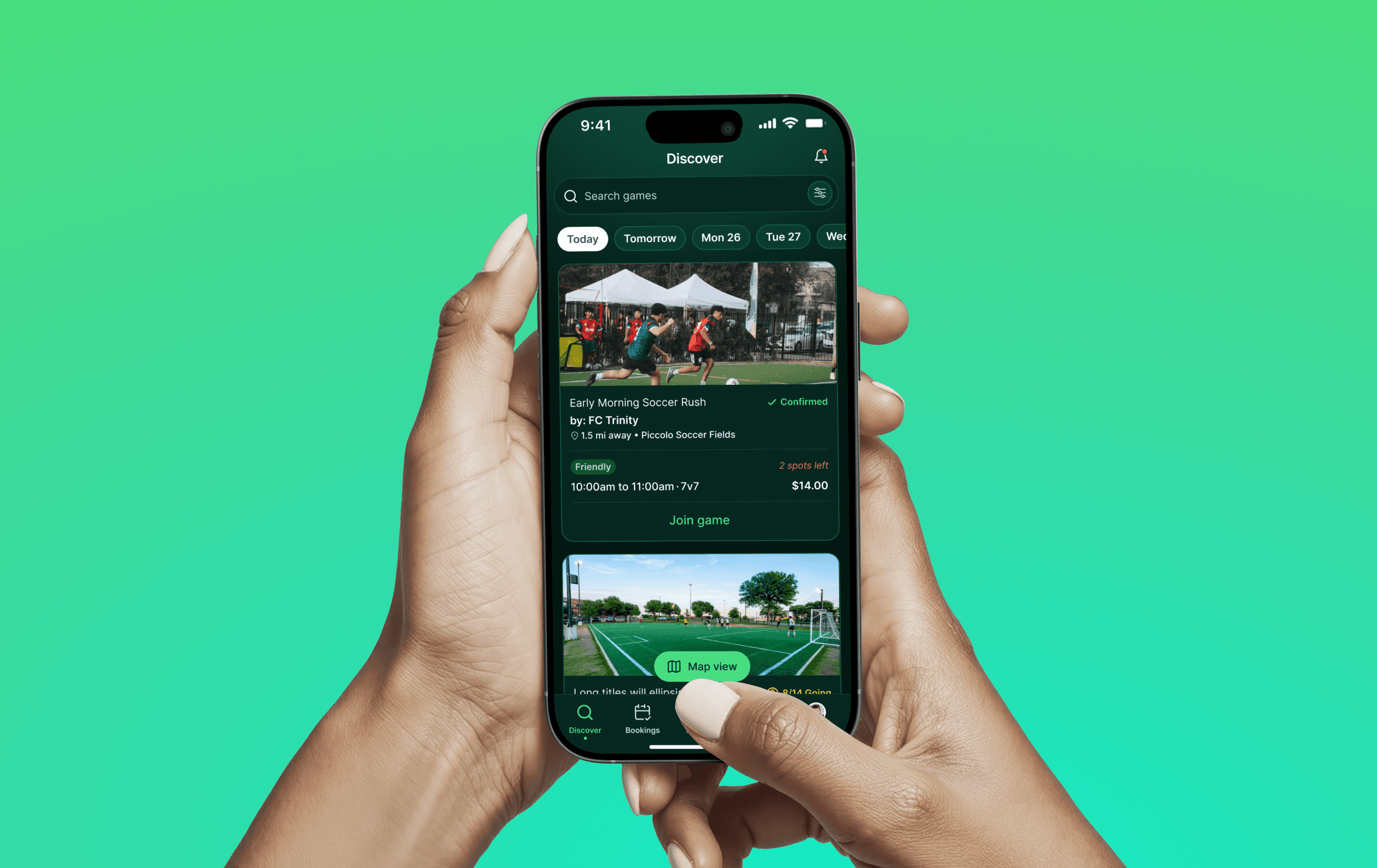
A full redesign of Plei’s mobile app that brought registration, game discovery, booking, and post-game feedback into a more cohesive journey—supported by a shared design system built for the product’s next stage.
- Year
- 2024–2025
- Industry
- Sports tech
- Company
- Plei
- Role
- Product Designer
- Capabilities
- Product design, Design systems, Mobile UX
Problem
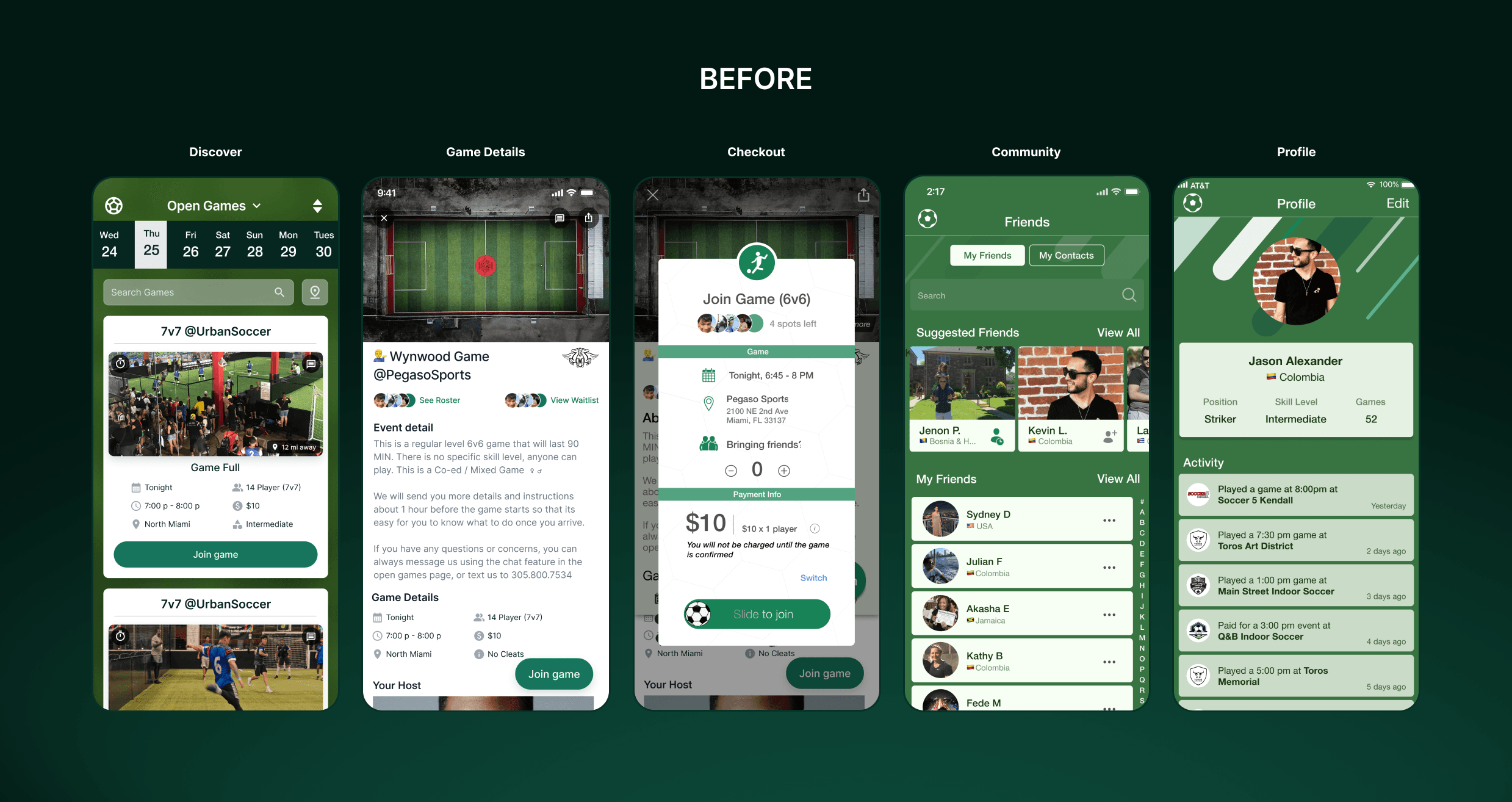
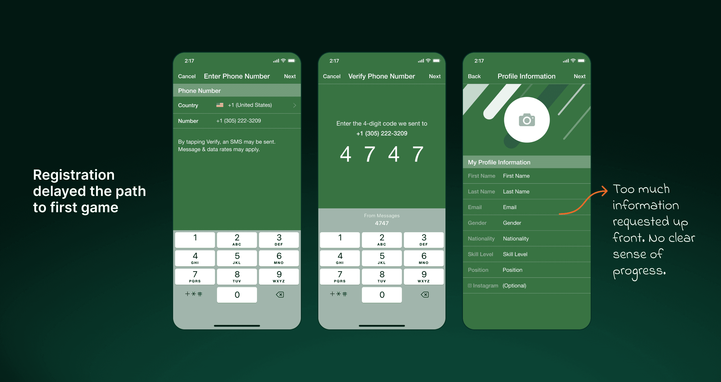
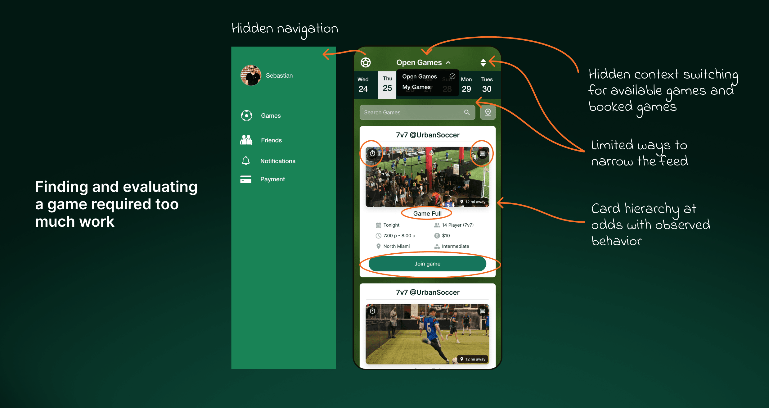
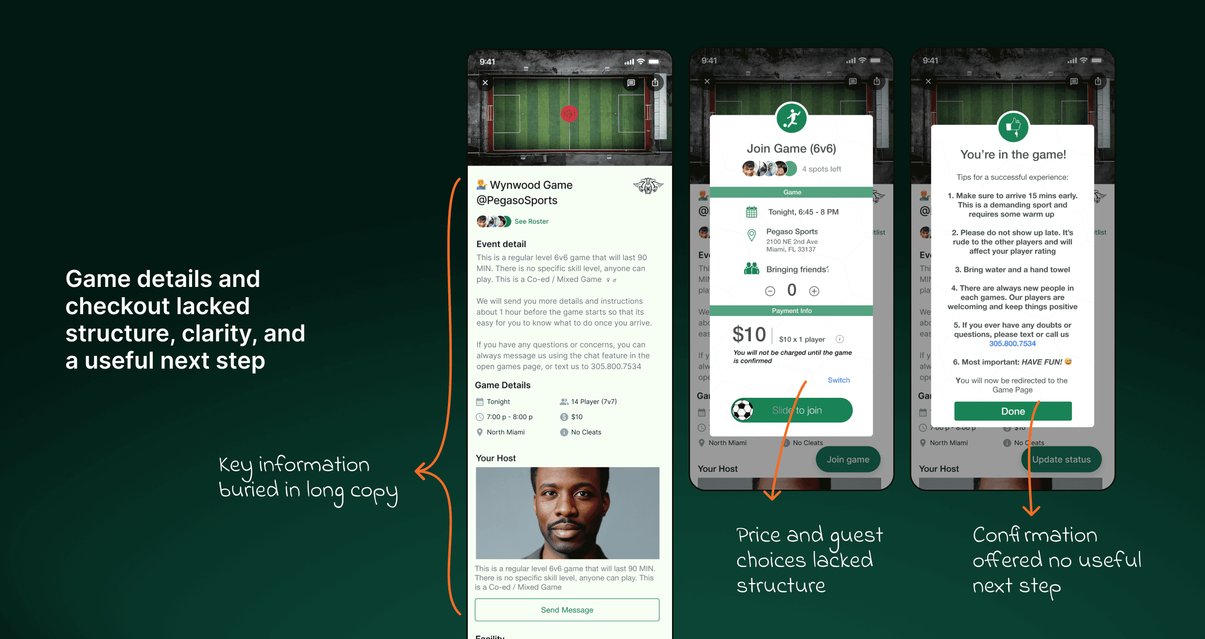
Plei’s mobile app had grown through years of incremental changes, leaving the journey to a first game inconsistent. Players had to complete a demanding registration before browsing, had limited control over game discovery, and faced dense details and a confusing checkout when deciding whether to join.
The underlying product was also difficult to evolve. Separate iOS and Android builds and inconsistent interface patterns slowed design and engineering work. Plei needed to improve the experience players relied on today while creating a shared foundation that could support the app’s growth and its eventual shift toward a marketplace.
Solution
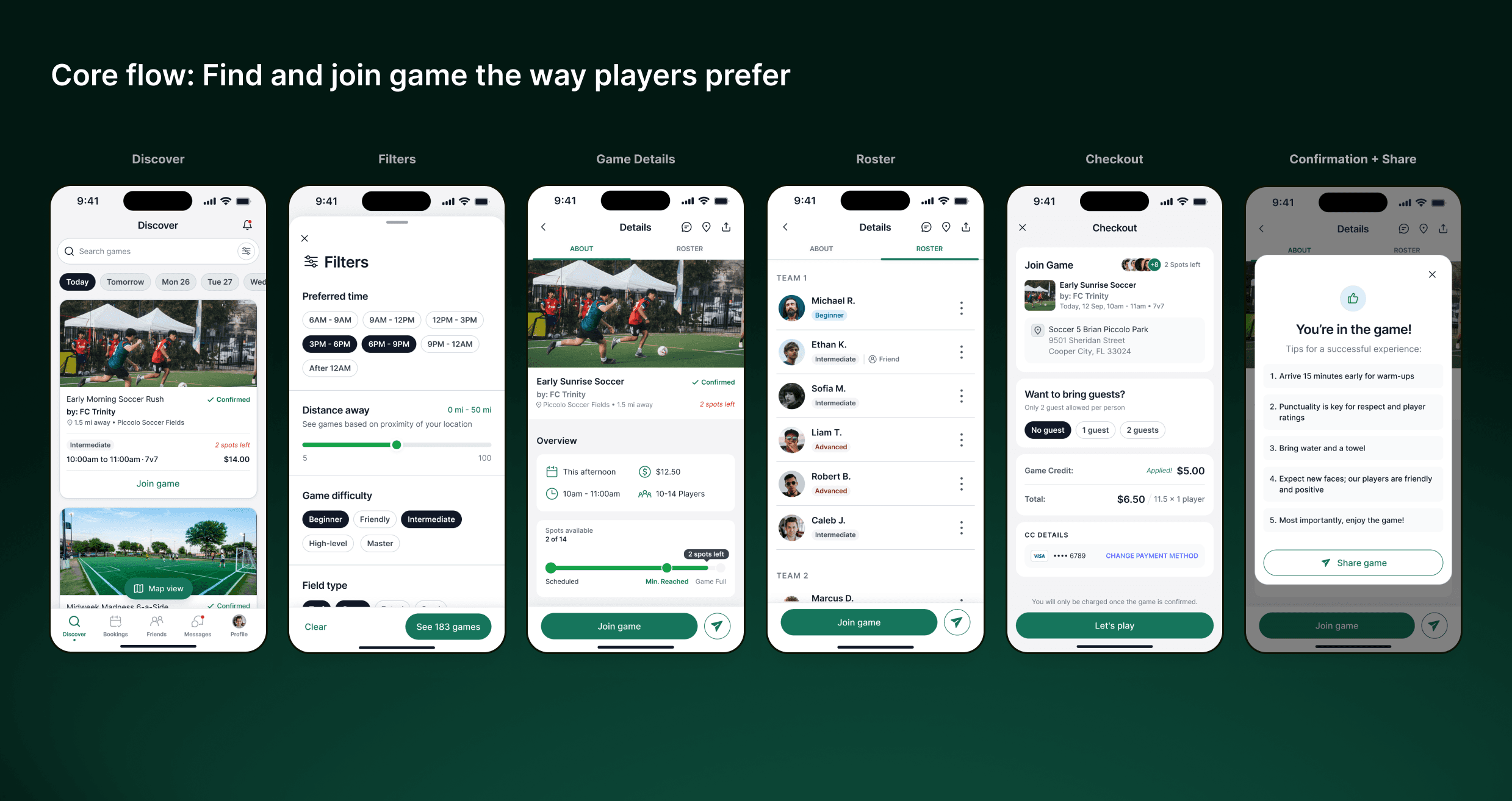
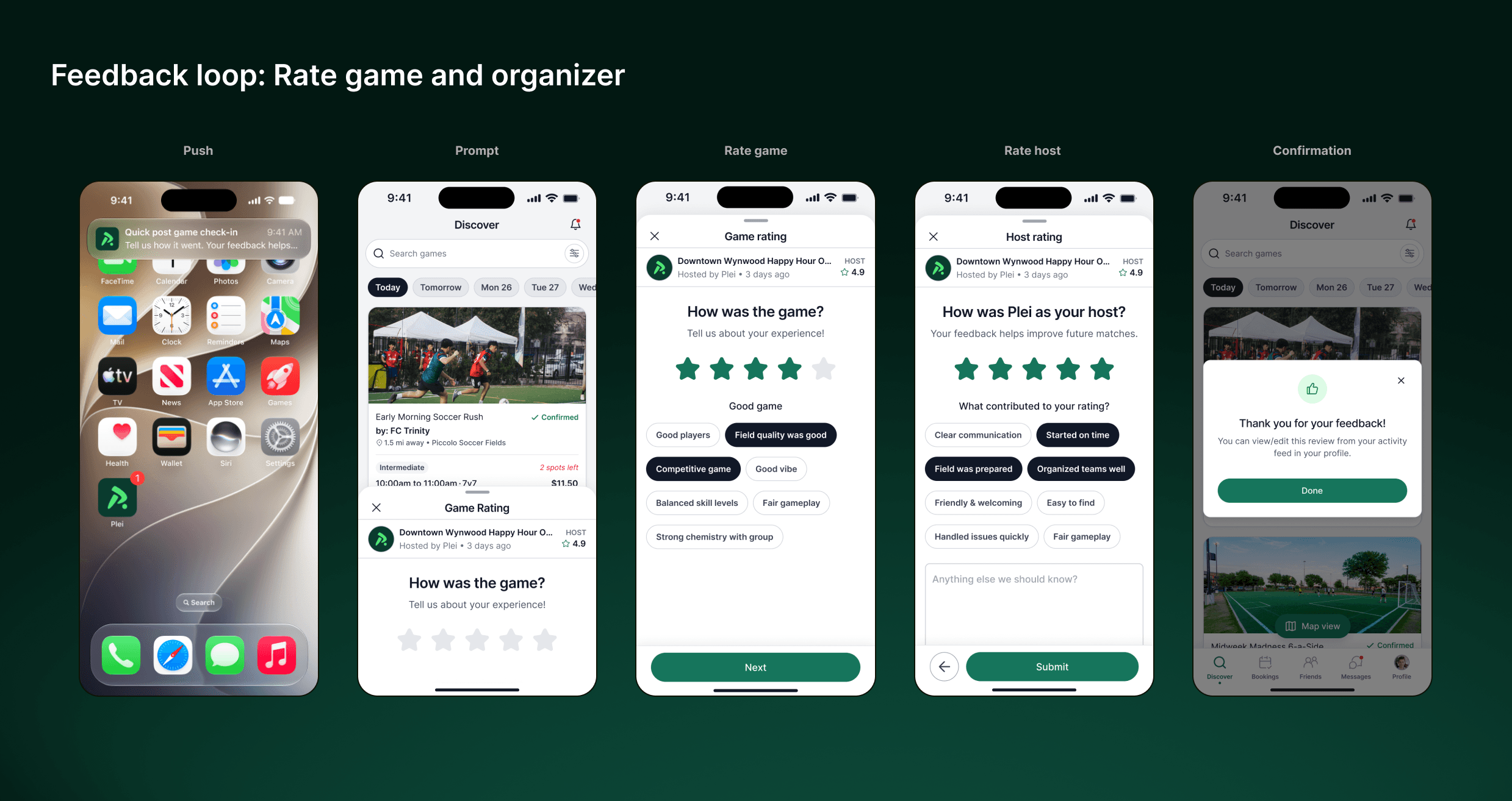
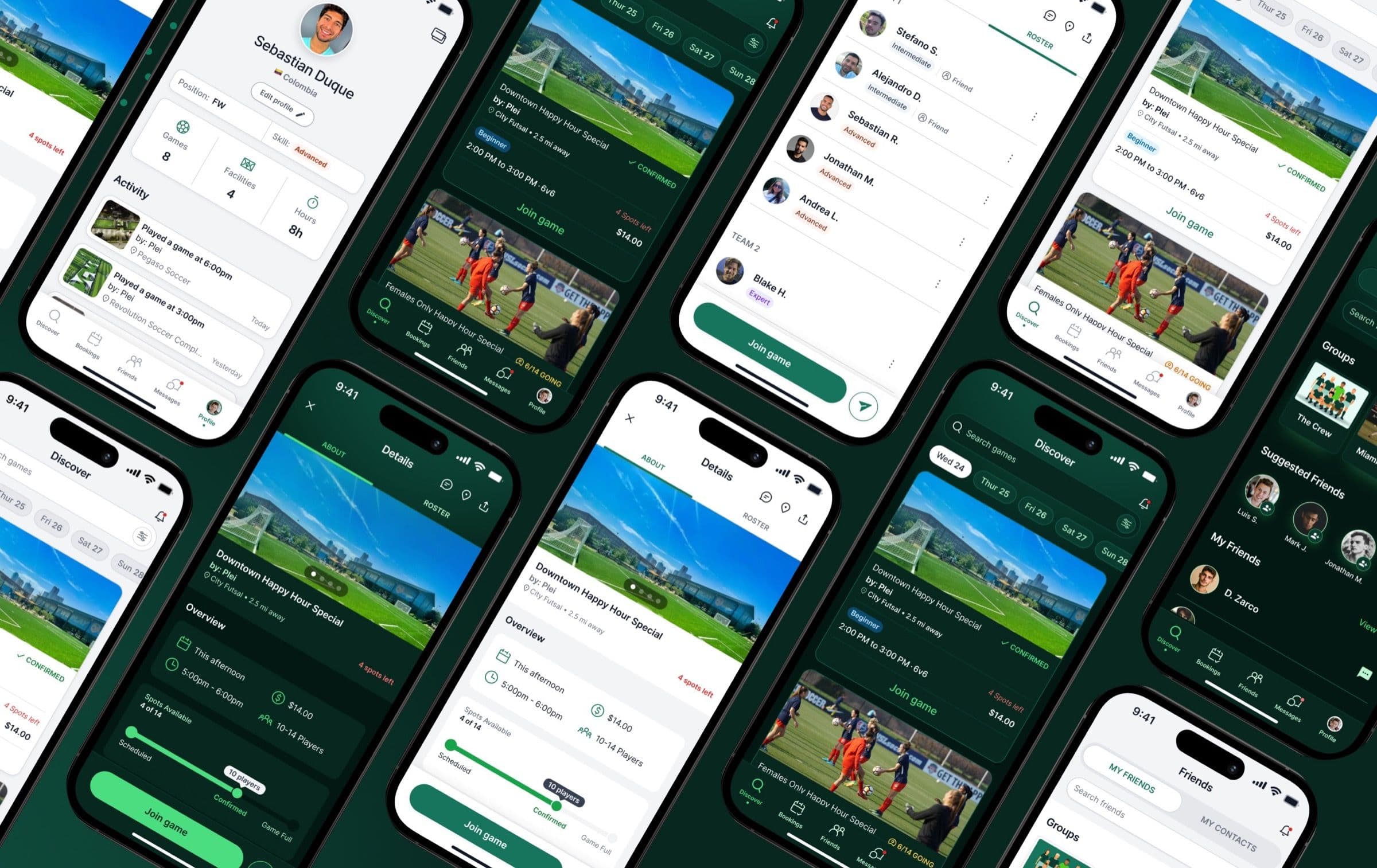
I led a full redesign of Plei’s mobile app, using the journey to a first game to establish clearer patterns for the wider product. Registration became a guided flow. Players gained more useful ways to narrow games, scan the details that mattered, review the roster, and join through a structured checkout. Confirmation made sharing a game a natural next step, while post-game feedback gave Plei a clearer signal about game quality.
Alongside those flows, we created a shared design system and rebuilt the app on a common React Native foundation. The work extended across the broader experience—including profiles, friends, and chat—so future features could be designed and built more consistently.
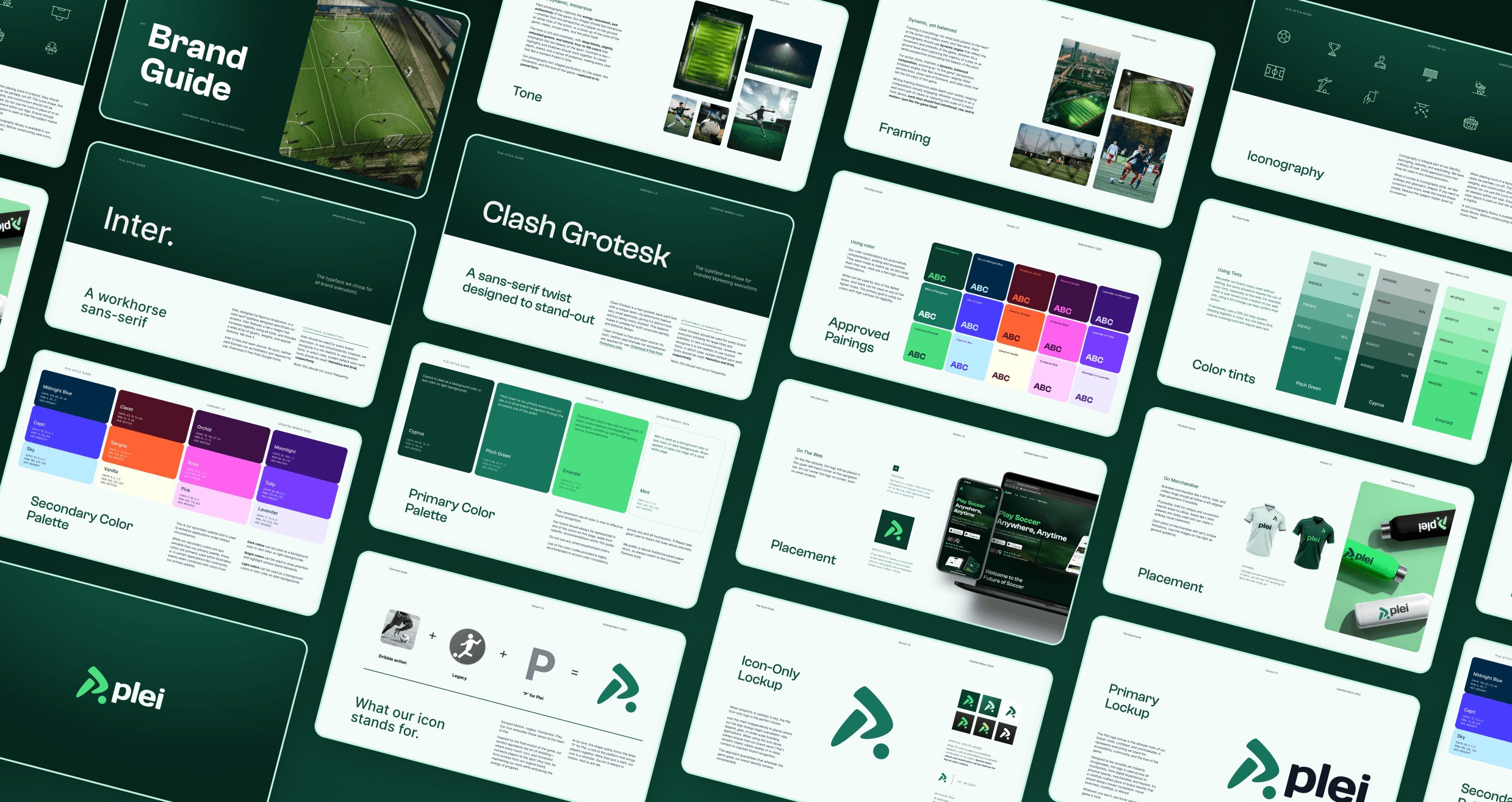
Owned the full rebrand of Plei 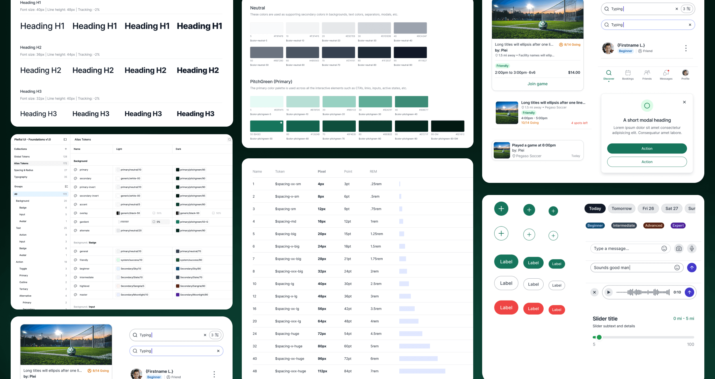
Built a design system foundation 0 –> 1 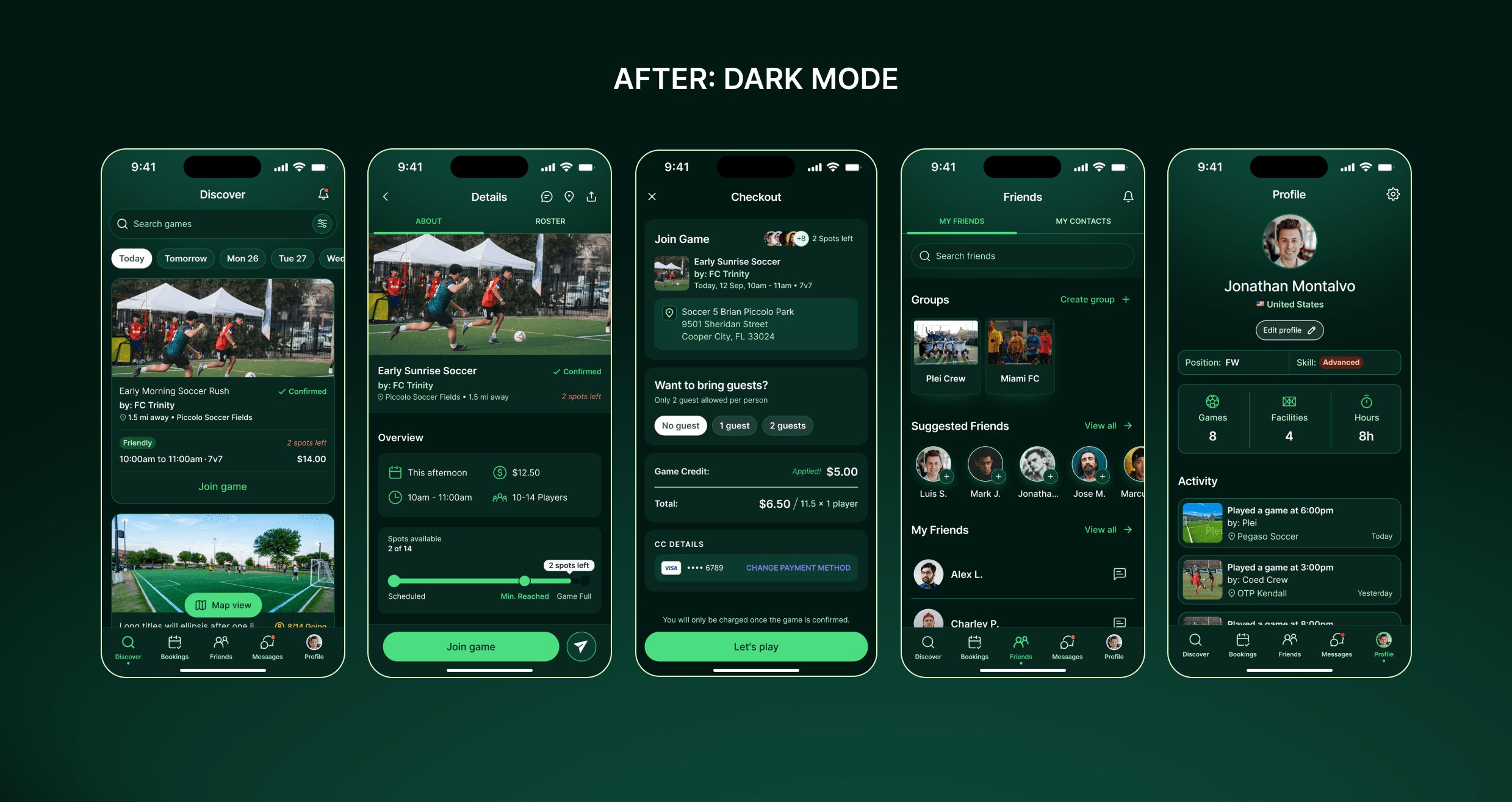
Structured alias tokens allowed us to implement dark mode theme for user preferences and delight 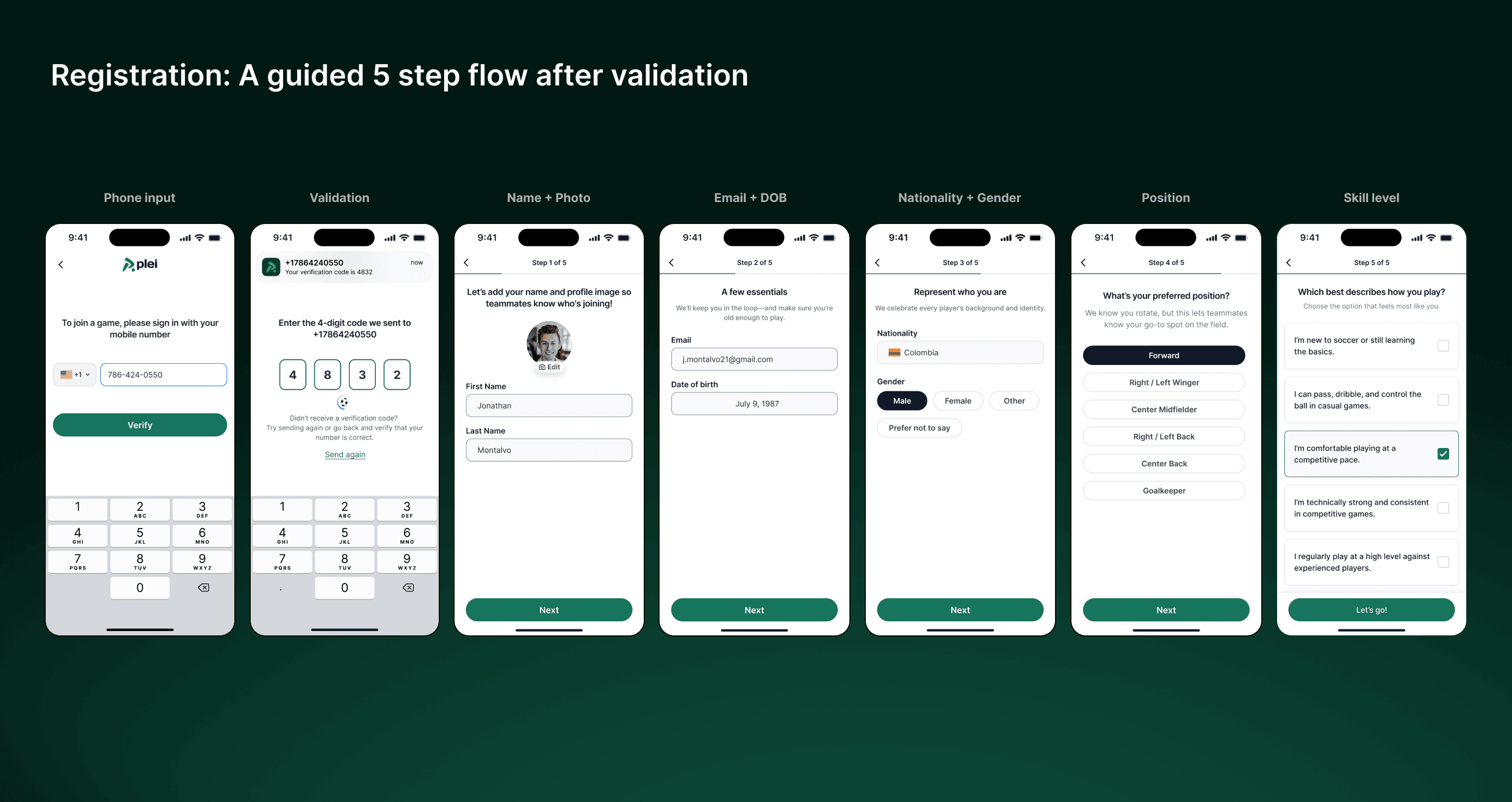
Challenge
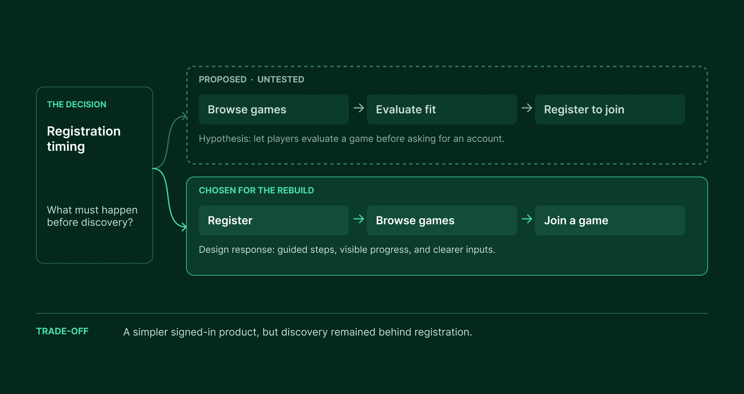
Plei’s full-app rebuild had to make the path to a first game feel easier, even though players still had to register before they could browse. I proposed a browse-first experience, but leadership chose to keep the app signed-in. That made registration the first test of trust: we needed to make its purpose and progress clear before players could see the value waiting on the other side.
The rebuild also had to balance immediate improvements with a foundation for the wider app. We prioritized the core journey—registration, discovery, booking, and feedback—while creating reusable patterns for features beyond it. In-app parental consent and a stronger first-game growth loop remained opportunities we could not include in the launch.
Outcome
The redesign established a clearer path from registration to a first game while creating a design foundation for Plei’s broader marketplace ambitions. Six months after the February 2025 launch, Mixpanel showed gains across three distinct measures:
- Registration: Completion increased 72% relative to the legacy app, from 43% to approximately 74%.
- First-game activation: Among newly registered players, the share who joined a game and remained on the roster within seven days increased 38%, from 46% to approximately 63%.
- 30-day retention: The share of players returning within 30 days increased 27%, from 16% to approximately 20%.
The gains were meaningful, but they did not resolve every barrier. Research continued to surface cost, inconsistent in-person game quality, and limited incentives for repeat play as reasons players did not return. The rebuild improved the digital journey; sustaining growth also required changes to the marketplace experience beyond the app.
Want the deeper walkthrough?
These case studies are intentionally concise. For a closer look at the thinking, craft, and decisions behind the work, reach out.